Sunday, May 5, 2013

Pre-Prac

It's been so long since I've posted something. Sorry but it's been busy at school.

Here are some things I've been working on.

 At first I did not know what I was going to do with this, I only cared about making the background into something I liked.
 I kept playing with shapes and organic matter but I was not quite sure what to make of it.
 I had recently returned from vacation and remember seeing the land below from the plan, so I thought of incorporating it in to this large piece.

One of the projects I did for another class was not AT ALL what I wanted it to be. So I decided in the short amount of time I had, I would work this one out to take it's place.

It is going to look weird but it is meant to be a mash up of different important things.

 So, I think it's coming along nicely but I feel as thought the upper left hand corner needs a lot of work.

I really like how it is at the moment but am afraid of adding color to the bricks. It's mean to look like a brick wall that has been tagged by school kids with only their first names.

Yeap, just as I thought, I'm not liking this colored brick wall idea. I think it's too strong of a color and taking away from everything else.

At the moment, this is what it looks like. I don't think I have enough time to change the color of the brick back to black but I will try to see if I can make time tomorrow.

Final post to be continued.

Thursday, February 28, 2013

2/28/2013

Work created today.

There is something more I want to add to the big one, which by the way is 36x48, but im still not sure what.

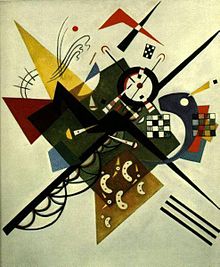
I chose these colors due to the feeling I got as I combined them. I took a moment to reflect on my pallet choice and was very pleased with the outcome.

I chose the light beige in the background due to my skin tone. The black is what I felt surrounded me for so long and from every corner. The red for all the pain, suffering, abuse and betrayals during my life. And last but not least, the turquoise for the new decision brightening my future. The one thing I would love to add is a poem I absolutely love but have to research to find it. I plan to handwrite this poem in small font size on the background xolor, giving it a different and curious texture.

Any ideas on a name?

Sunday, February 17, 2013

Inspirations... Wassily Kandinsky

What can I say about all this. I have loved this type of imagery for as long as I can remember. I specially love Kandinsky's choice of color since its what I'm drawn to. 

I have know of a teacher who believes that the attraction to my color choice is probably a cultural thing but I don't really care to understand why. I just like it! I feel like I can say a lot based on my color choices and feel something while using it because of its vibrancy.

I intend to continue using bright colors and manipulating them through different mediums and possibly styles. Since I've been told that sometimes you outgrow what you are attracted to, then I will continue in my path until I'm drawn to something else.

I guess and hope that what matters is that I continue to make art.


All images were collected through google images....